How to understand Bootstrap grid system?
Our Joomla 3 templates support bootstrap grid system and may use fluid or fixed width.
Fixed option
The template width depends on the device resolution that you use to browse the site.
The width of the template layout will decrease gradually if you browse the site on smaller screens.
| resolution | template width |
|---|---|
| 1200px and up | 1170px |
| 980px and up | 940px |
| 768px to 979px | 724px |
| 767px and below | all columns displayed one after another (100% vertically) |
Bootstrap grid - 12 columns idea
Bootstrap grid system allows you to place many modules at the same template position and what is more you can specify the number of columns you want to use for each module.
The global idea of dividing module position looks as follows:
Equal cells widths.

The wrapper container uses 12 basic cells.
The sum of specified and used bootstrap size numbers must give 12.
Various cells width.

The width of the particular container can include various bootstrap size. This way you can specify various width for any module container.
How it looks in practice?
There is an important difference in using bootstrap grid idea between fixed and fluid options.
Fixed option.
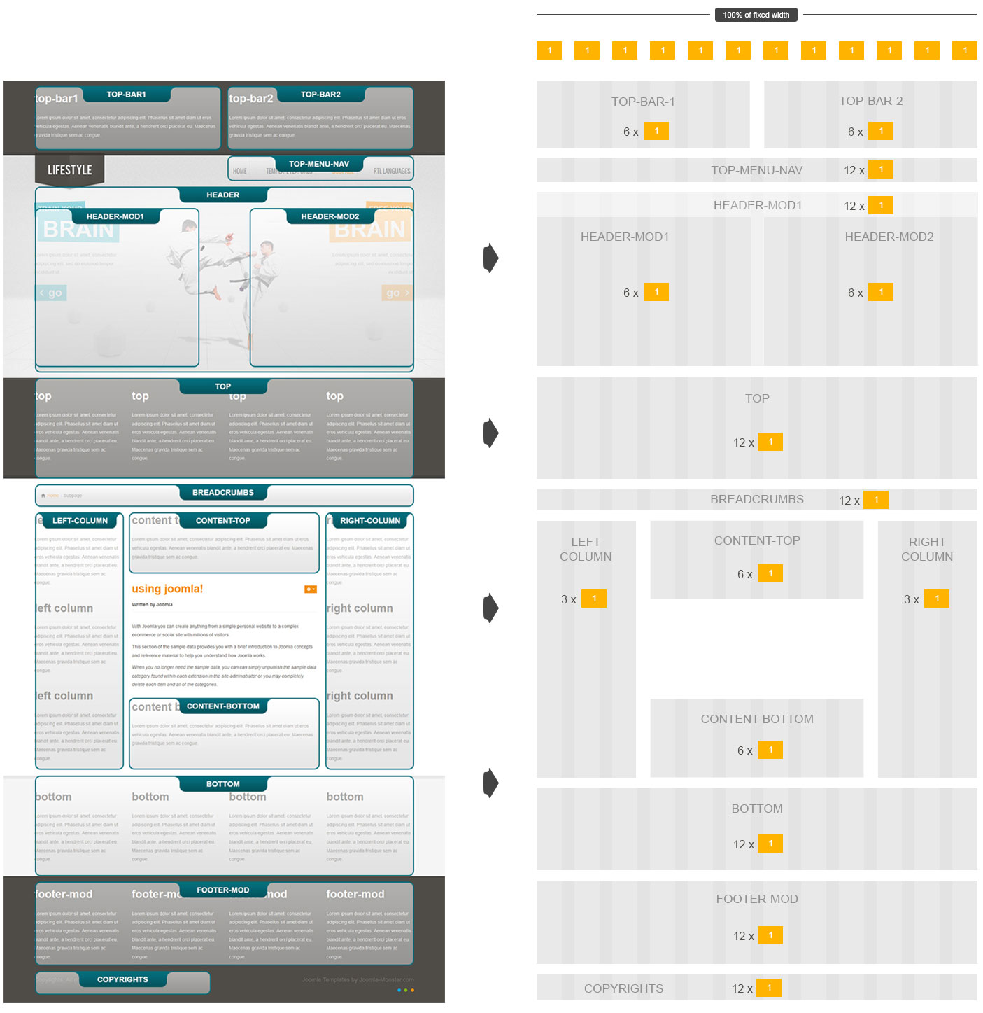
Let's take our free template JM-Lifestyle as the example.
At the left side we've got the screenshot of the site of all template layout positions.
At the right side we've got 12 grid column graphic convertion of the template layout.

All module containers displayed in one row must give 12 wrapper cells if you sum up all of them.
Now if you would like to divide any template position in more columns have to remember that the total sum of cells must be 12.
Lets do the example.
Example 1 - fixed option.

We are going to reflect the example above for top-bar-1 and top-bar-2 template positions.
Now we have to create 2 modules at top-bar-1 position and 2 modules at top-bar-2 position.
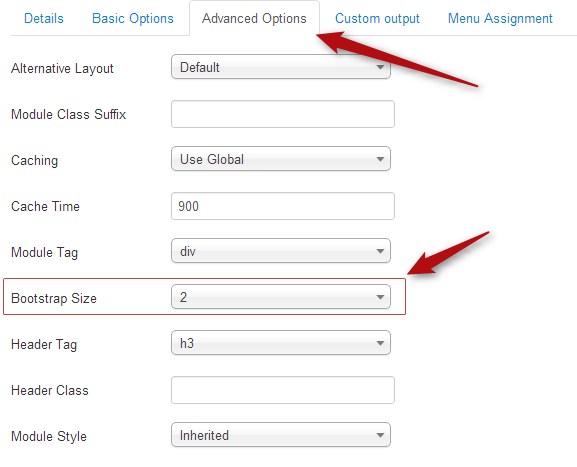
We have to specify the value for Bootstrap Size parameter in Advanced Options of each module.
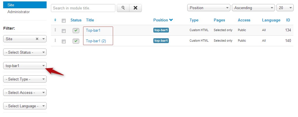
Navigate Extensions -> Module Manager , then choose top-bar-1 position in the filter.

Then edit each module and set Bootstrap Size:

For 2 modules at top-bar-1 position, set 2 for Bootstrap Size parameter for the first module and 4 for the second one.
For 2 modules at top-bar-2 position, set 3 for Bootstrap Size parameter for the first module and 3 for the second one.
Then set the correct order and take a look at the result.

Lets do another example for bottom module position.
Example 2 - fixed option.

Now we've got 3 modules in one row assigned to bottom template position.
For the first module we've set 3 value for Bootstrap Size parameter.
For the second module we've set 3 value for Bootstrap Size parameter.
For the third module we've set 6 value for Bootstrap Size parameter.
The result looks as folows:

Fluid option.
This option is more extended.
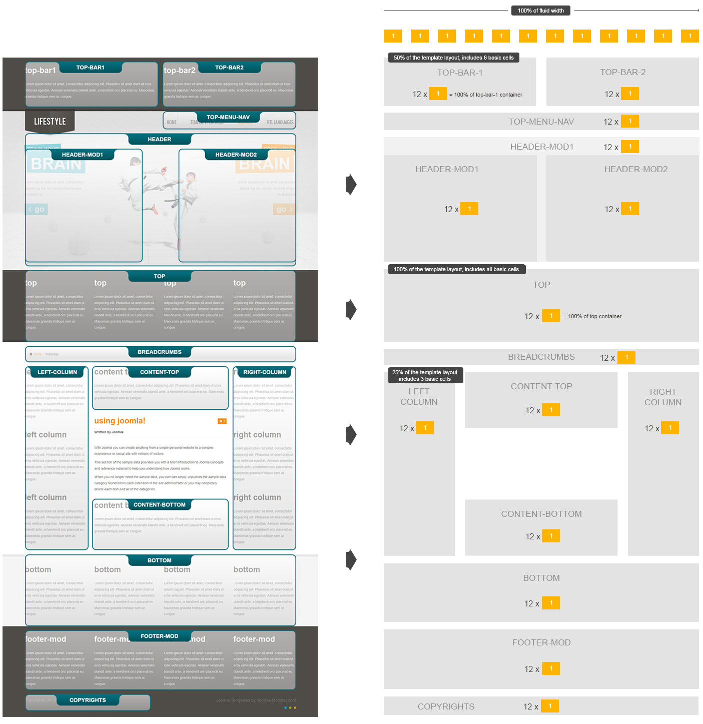
In comparison to the fixed option, the sum of bootrstrap size numbers of module containers that are placed in one row do not give 12 wrapper cells.
But each module position can be divided in 12 containers, so the global counting will be a little bit different.

Now the sum of wrapper cells is 12 but in addition you can also divide each column into 12 cells.
Let's do the same examples as for the previous fixed option, this will be the best way to understand the idea.
Example 1 - fluid option.

For 2 modules at top-bar-1 position, set 2 for Bootstrap Size parameter for the first module and 4 for the second one.
For 2 modules at top-bar-2 position, set 6 for Bootstrap Size parameter for the first module and 6 for the second one.
The result looks as follows:

Example 2 - fluid option

As you can see the values for Bootstrap Size parameter stay the same as for the fixed option.
Why? Since the number of wrapper cells is 12 for fluid option as well and there is just one position in one row - bottom template position.
So we do not have to share the place with any other containers than bottom one.
Configuration for Boostrap Size parameters stays the same:
For the first module we've set 3 value for Bootstrap Size parameter.
For the second module we've set 3 value for Bootstrap Size parameter.
For the third module we've set 6 value for Bootstrap Size parameter.
And the result does not change:
