How to hide or show content on mobile devices and desktop on Joomla site?
Every year the number of mobile users is growing significantly. To increase the mobile conversion, you may need to show or hide certain content only to mobile users. This action results in better user experience and in faster loading of pages. In this article, we will show you 3 ways to show or hide content by device.
Use Bootstrap responsive utility classes
If your Joomla template is based on Bootstrap framework, you can use the available Bootstrap classes to show or hide content by screen resolution. We have a separate tutorial on this topic which describes step by step how to use the utility classes as Joomla module suffixes or as HTML class attributes:
How to show or hide content by device?
If you are looking for a quick and simple solution to show/hide content, Bootstrap utility classes may be very handful.
Use Layout Builder visual tool in EF4 framework
We realize that using Bootstrap classes may not be intuitive for all. Our EF4 Framework Joomla templates come with Layout Builder which is a great visual tool to customize the template layout for specific devices. One of the available features is the ability to show or hide selected module positions or entire sections depending on the screen size of the device.
In your Joomla back-end go to:
Extensions -> Templates -> Styles -> [template-name] -> Layout Builder
On the "Customize Responsive Layout" tab, you will find the tabs to switch between the devices (1) and the template layout for the currently selected device (2):
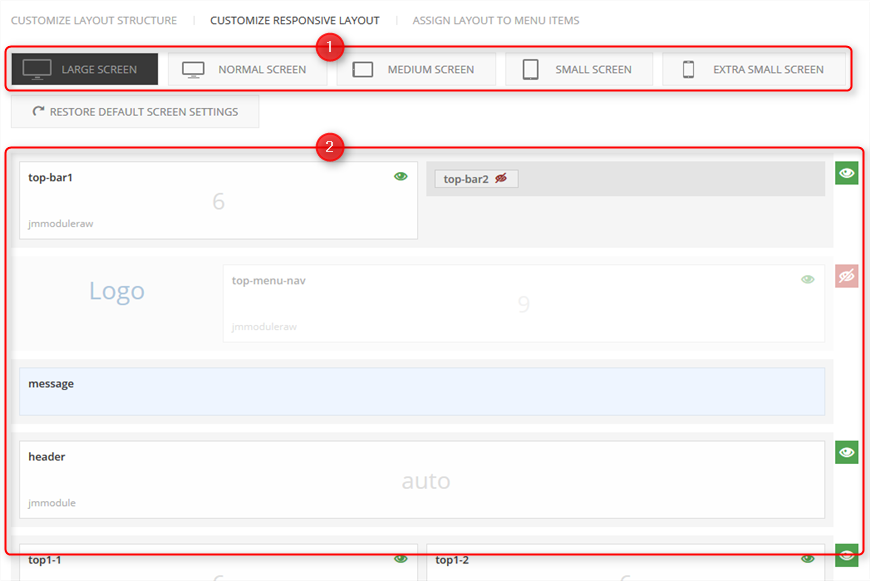
Using the tabs, you can change the template layout settings for each available device:
- Large Screen - 1200px and above, usually desktops
- Normal Screen - 980px-1199px, usually landscape tablets and desktops
- Medium Screen - 768px-979px, usually tablets
- Small Screen - 481px-767px, usually portrait tablets and landscape mobiles
- Extra Small Screen - 480x and below, usually mobiles
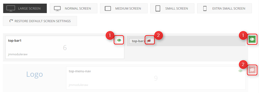
In the corner of each module and section, you will find an eye icon. By clicking the eye icon, you can show/hide the selected module position or section. The green color of the icon (1) means that the module/section is visible for the currently selected device, while the red crossed eye (2) means the module/section is hidden:
Remember to save your changes after you finish.
If you would like to find out more about available settings in Layout Builder, check out the EF4 Framework documentation:
Use Advanced Module Manager for Joomla
Both previous methods (Bootstrap utility classes and Layout Builder) rely on hiding content using CSS styles. It means that the content is loaded on the page but it is simply hidden using the "display: none" style.
What if we do not want the module to load on mobile pages at all? Then you may find the Advanced Module Manager from Regular Labs very interesting. It is a Joomla extension that brings many useful settings to control the way the modules are displayed on your site. One of the settings is the ability to show or hide the module by the device.
Step1: Download the extension.
Step2: Install the module as described in the documentation.
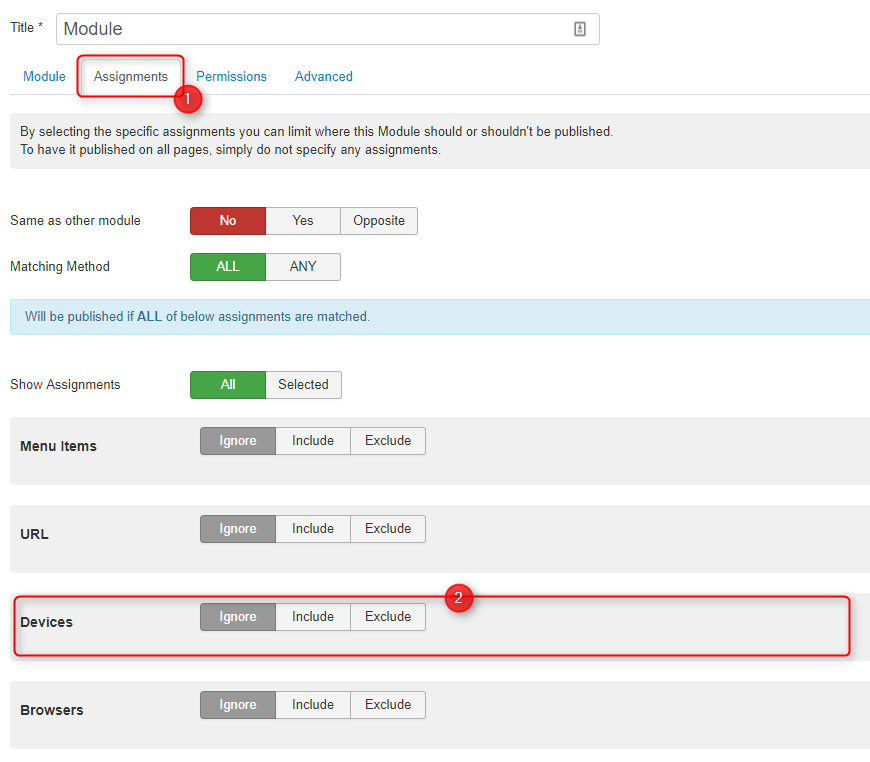
Step3: Go to Extensions -> Modules and edit the module which you want to show or hide by the device.
Step4: Open the "Assignments" tab and go to the Devices bar:
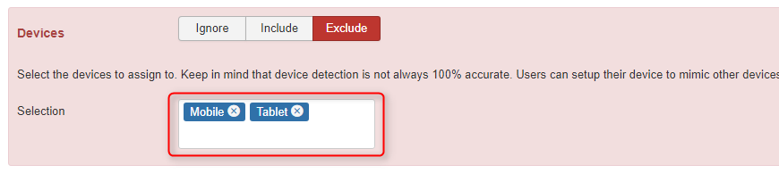
Step5: Choose "Include" to show or "Exclude" to hide the module for selected devices:
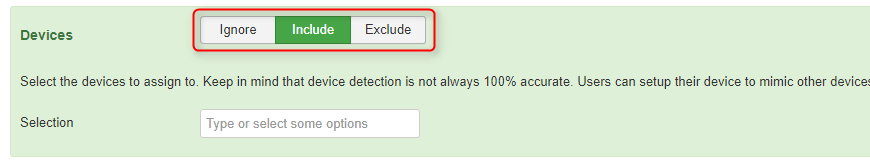
Step6: Select the devices for which you want to show/hide the module:
Remember to save your changes after you finish.
Complete documentation for the Advanced Module Manager extension you may find here.